The TechSavvy will receive a commission if you purchase anything through the links on this page. So, please! do so to support us.
Get your tech items, back-to-school essentials, house furniture, computer, and car replacement parts at the lowest prices here.
Hey everyone, I'm Mac, a student, programmer, and Game developer currently working on an FPS Shooter game, and this week I am going to talk about how I redid the entire UI for the game. So for those of you who read the previous devblog , you can check out here by the way know what I do is tell you everything I did during the day. But since the only thing I did this week game-wise was arranging the UI to make it more appealing to the eye (sorry, I did not have a lot of time since I started revising for school again). I will take a different approach when writing this blog. I will go over the different things I changed and my thought process when creating the different UI Elements.
UI is the trickiest thing to get right in game development. It is very difficult to find a style that perfectly fits the visuals of your game. I did the UI for the game about 4 times. But this time I think I finally found a style that fits the game well.
I want to emphasize the fact that I am not a UI expert here so please Don't judge me. I had to learn how to use GIMP with some great YouTube Tutorials and I managed to create this
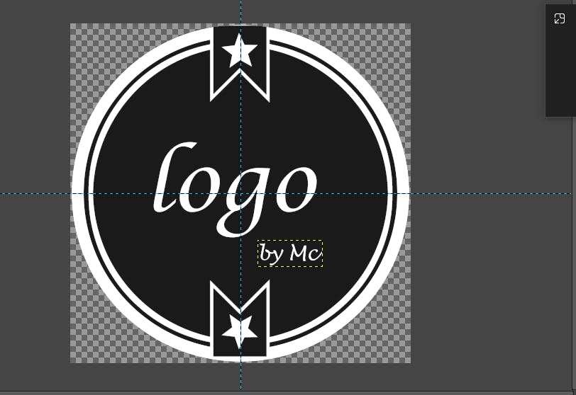
This gave me a lot of confidence and I then decided to stop learning and dive Head-First into the Overhaul of the Game Visuals and this is how it turned out...
Before reading, don't forget to *Like and Follow the blog. It will be really nice of you if you did that and for those of you who want to continue the conversation, you can still join the McDev discord server.
Story Background
So the first thing I decided to work on was creating a background image where the story of the game will be placed. What I had before was just a black square background, which, as you can guess, looked very ugly. So I decided to change it with a new image. I wanted something a bit blue-ish green so that it could match the color of the main menu. The first image I had was this.
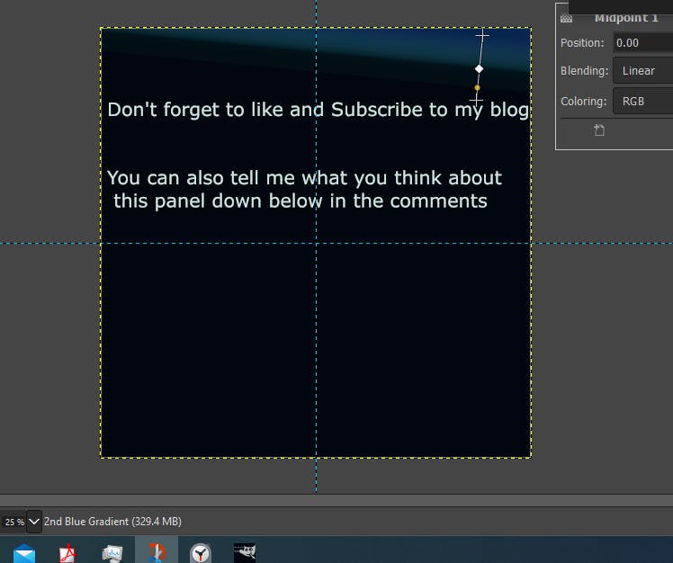
The story written on it brings tears to my eyes
It looked good at first after staring at it for some time, I felt something was wrong. B. So I continued playing with the gradient tool in GIMP and after some time I came up with this
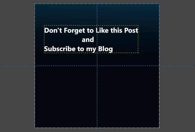
which I think looks absolutely GORGEOUS! It's Simple and it goes perfectly with the colors of the main menu.
HUD
HUD stands for Heads-Up Display and it is basically all you see on the screen when you are playing. The HUD I had looked horrible and very unappealing. It was just a gray health bar and a gray hunger bar that looked so dull. So fixing this was the next logical step. I decided to change the colors and the icons of the two bars. Then I had to arrange the Panel Showing you all the information about the Ammo ,I think this was my second favorite creation of the UI overhaul, just check it out by yourself

Even though the Ammo Panel looks great, I still wasn't satisfied with the bars. I promised myself that I will not work on it again but I just couldn't stop thinking about it. The next day after watching my brothers play Genshin Impact (Great Game by the way), I had an idea. I got inspired by the way Genshin Impact made their HUD. There is some sort of Transparent fill in the bar that looked so cool and I knew it will be a very good fit for the game. I directly got back to work and I implemented the New bars and this is how the HUD looks now

And honestly, I think it looks nice. Don't forget to tell me what you think about it in the comments below.
Pause Menu
I never really knew what to do with the Pause Menu. The Pause menu in the game looked very ugly but I had no idea how to improve on it. Look at it (*Not for too long please because it is embarrassing *)
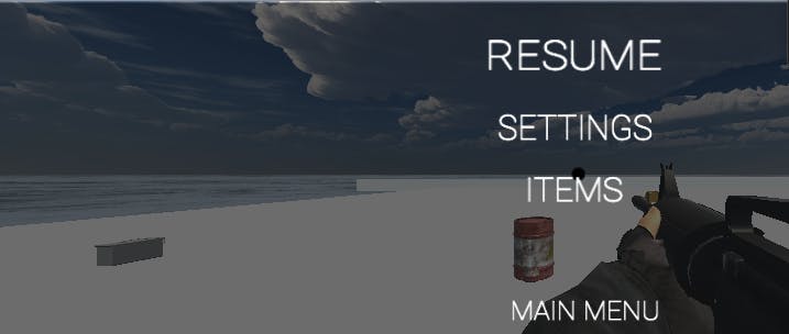
I tried different designs in GIMP that all looked magnificent
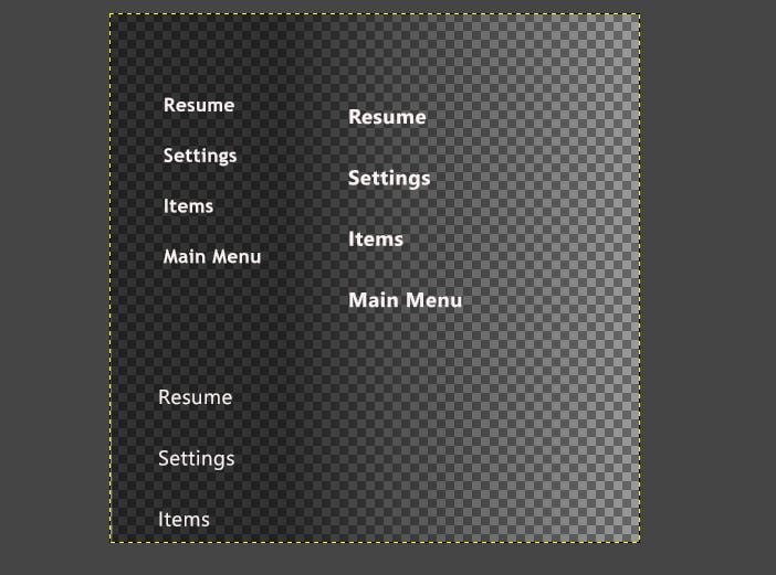
But in the Unity Editor, they didn't look good. So I was forced to use the default Unity UI System, which is, errmm, well let's not talk about it. I wanted to do something simple for the UI. So after a lot of tweaking, I came up with this

which I think doesn't look too terrible (Which means it looks like shit). I know it's not really good but I think it does the job and I could finally move on to something else.
I know this week wasn't really exciting but I think next week's devblog will be better. Nonetheless, I hope you enjoyed reading this post. Don't forget to LIKE! and Follow my blog if you liked it and if you didn't like, it don't forget to tell me in the comments down below also. I also hoped it provided you with some insights into the world of game development and that it motivated you to start if you were hesitant. Once more my name's Mac and I'll see you all Next Time!

